

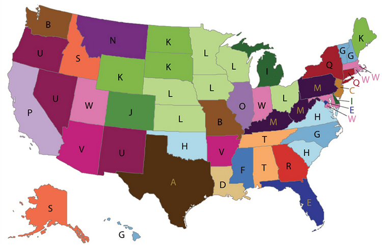
People in Pennsylvania and other coal-mining states are disproportionately more likely to die from black lung disease than the rest of the country.
Not a huge surprise there, but what about in Louisiana? It’s syphilis.
Or Arizona? Getting shot to death.
Florida? HIV.
That’s according to a weird new map published by the Centers for Disease Control and Prevention that looked at the most distinctive ways people die in each state and Washington D.C. from 2001 to 2010.
It’s important to clarify that the map doesn’t show the most common cause of death per state, but rather a cause of death special to each state that is higher than the national rates for those causes.
However, this means that sometimes only a handful of people are dying from these conditions. For instance, only 22 people died from syphilis in Louisiana and, in Montana, only 11 people died from rapidly progressive nephritic and nephrotic syndrome, which is a type of kidney disease.
Here’s the original map (and here is a breakdown of the researchers’ methods):
Mother Jones made another map with the causes of death translated from medical jargon to laymen’s terms:

The map’s creators said they had seen maps become popular on social media in recent years depicting things like popular baby names or music, and wanted to make one with a little more clout.
“I wondered what it would look like if you applied this to something more serious, like mortality data,” Francis Boscoe, a researcher with the New York State Cancer Registry who made the map, told NPR.
It looks like the researchers got their wish. The map has gone viral on social media and has been covered by dozens of news outlets.
Boscoe told NPR that the map has already sparked conversations with public health officials in some states about how to improve the classification of deaths.
Reach Natasha Khan at nkhan@publicsource.org or 412-315-0261. Follow her on Twitter @khantasha.


